


Improving my handwriting using 16th century writing manuals

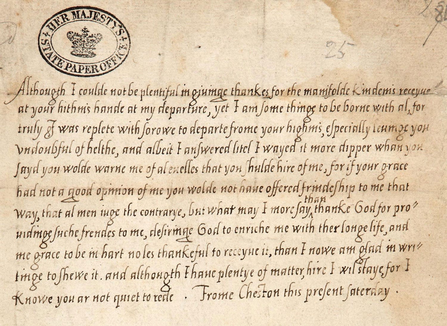
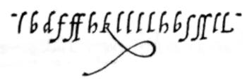
I’ve been obsessed with improving my handwriting since finding these Elizabethan letters below. It’s a form of italic (or Italian chancery, cancellaresca corsiva) that was mainly taught to women. Martin Billingsley in The Pens Excellencie says:
It is conceived to be the easiest hand that is written with a pen, and to be taught in the shortest time: therefore it is usually taught to women, for as much as they (having not the patience to take any great pains, besides fantastical and humoursome) must be taught that which they may instantly learn.
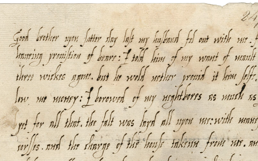
I find the above example to be incredibly clear to read, with even spacing between letters and words, and particularly love the shape of the a/d. More examples below:


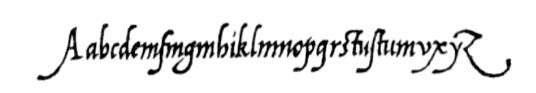
I really like this form of calligraphy mainly because you can try it with a ballpoint pen!
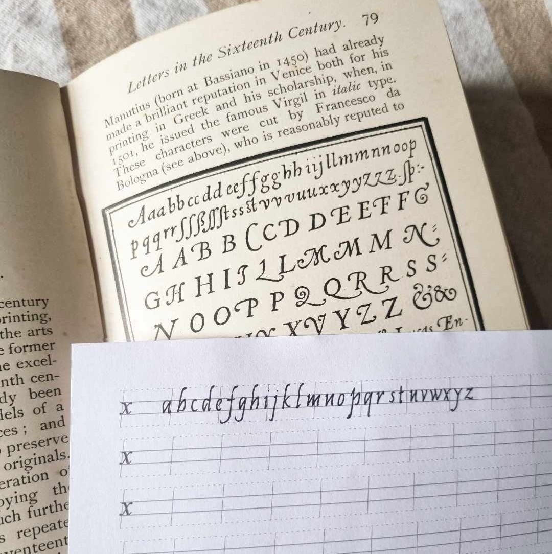
There are three main Italian scribes who popularised Italic: Ludovico Vicentino degli Arrighi, Giovanni Tagliente and Giovanbattista Palatino. Arrighi was the first to publish a writing manual on the subject titled La Operina in 1522 and was the basis for my own studies which I’ve broken down in dot point lessons below!

The lessons - La Operina 1522
Use an oblong shape for the body of the lowercase letters, not a square, the letters will turn out too circular if you shape it inside a square.
Ascender lowercase letters should have an extreme tip a trifle thicker. He suggests to do this by starting the letter with a line going left to right, and then going back on that line (right to left) slightly and continue with the vertical downstroke. (I personally don’t do this much)
These letters begin with a thin upward diagonal stroke
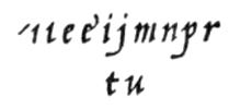
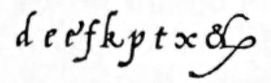
The letters p and t should be a fraction higher than the other letters (the straight part of p). t should be shorter than the other ascenders (d, h, l, k, b, f). Compare p & t below with other ‘x-height’ characters
The letters x and y are bisected in the middle (interestingly, y is bisected in the same way and not at the baseline)

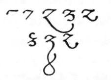
And finally z
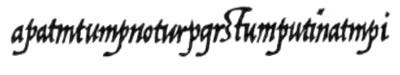
These letters are made in 1 stroke

These letters are made in 2 strokes
Interestingly, e is made in 2 strokes! From other writing manuals of the period it’s suggested that e is started the same way c is made, and then the second stroke closes the eye of the e.
Lowercase letters should slope slightly (5-7 degrees)
Uppercase letters should stand upright. He also adds to make them with “confident, defined strokes without any shakiness in them, otherwise they will be devoid of elegance”. (See image preceding the lessons section)
The distance between words should be equivalent to the width of an 'n'. While the space between letters should be equivalent to the white space between the legs of n. He does mention it’s practically impossible to observe this rule but just try to use your eye’s judgement.
Hope these pointers help on your 16th century handwriting journey!
-Jess
Guidelines
I’ve made some guidelines using this website with the correct spacing for ascenders/descenders as well as a 6° slant. In the download you’ll find A4 and US letter sizes to print as well as dark and light guide lines. Dark is best if you want to place it underneath a blank sheet of paper and light is best used if you want to practise right on the guidelines.
Resources
Scribes and sources: handbook of the Chancery hand in the 16th century. by A.S Osley.
A really fantastic translation of the major Italian scribes and their writing manuals.
A compilation of the three major Italian writing masters in the original Italian.
Full translated edition of La Operina in calligraphic italic. Although it is a lot more stylised than the original.
Liked this article? You can now also buy me a coffee!
Fantastic article! Thank you for sharing the resources at the end 😀
Thanks for sharing! I've recently begun writing in cursive again and even purchased my first fountain pen.