


On Margaret Ely Webb’s Lettering
An exploration of the different styles found in Webb's bookplates

Miss Webb employs a wise variety of styles of lettering in her designs, but almost invariably succeeds admirably in clarity and beauty in name and motto. She appears to work from the first conception of a design with the idea in view, that the lettering must belong.
- Wilbur Macey Stone on Margaret Ely Webb, 1924
For those who don’t know, Margaret Ely Webb (1877–1965, American) is my all time favourite bookplate illustrator and I’m always on the hunt to find out how she pulled together her illustrations. In particular her lettering is always so appropriately chosen, integrating seamlessly with the linework in her work. The lettering in the bookplates are never an afterthought but an integral part of the overall design.
Earlier this year I found an article from The School Arts Magazine (November 1914) where an interview with Webb mentions where the beginning of her lettering journey started:
‘…Mr. Kellogg, the publisher, sent for her one day, remarked that her lettering was very poor and suggested her buying a manual on the subject. This she did, a book of Mr Strange’s, and “began to improve.”’
Now, “a book of Mr Strange’s” wasn’t much for me to go off but after doing Google searches for “lettering” and “Strange” I came across this book called Alphabets by Edward F. Strange! First published in 1895 the timing would make sense with Webb’s first illustration job at The School Journal with Mr Kellogg.
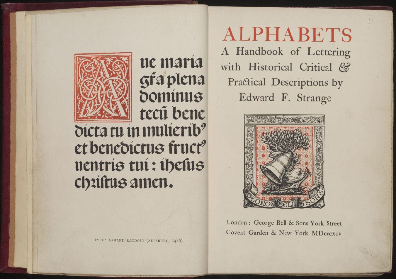
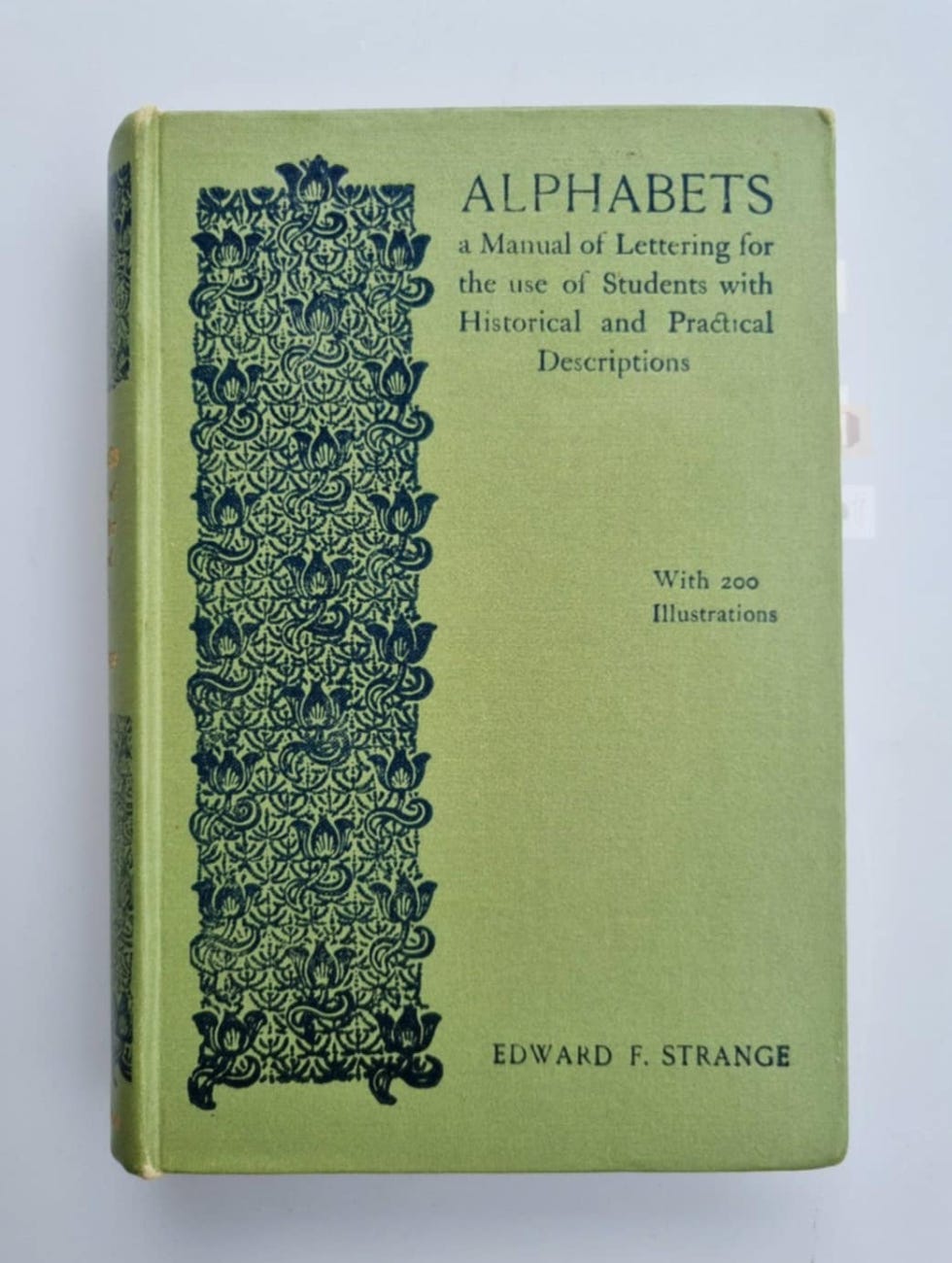
I was able to find a used copy from a bookseller in New Zealand and after a few weeks I had my own copy! This book was published as part of the ‘Practical Designing Series’ edited by Gleeson White, of the influential Studio Magazine. In it you’ll find the history of lettering from Roman lettering to manuscripts from the middle ages down to the 19th century. At the end of the article I also link to its e-book you can read online.


Calligraphic script
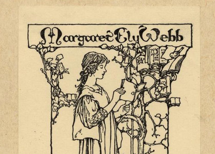
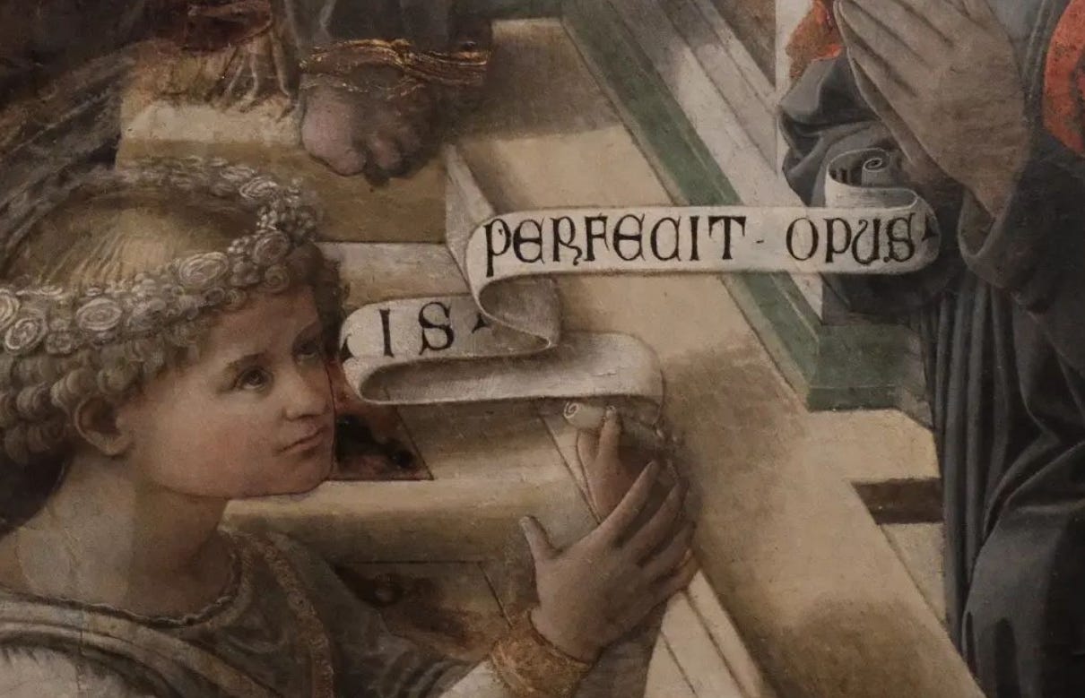
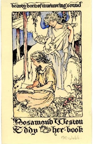
Only recently did I find proof that Margaret Ely Webb used this book. The bookplate below has some very distinctive letters which are a near perfect match of an alphabet on page 189 of Strange’s book. The very exaggerated y, the extra stroke/kink on the top right of the m, the upturned e should all be noted.


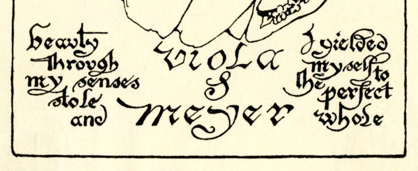
It’s a very upright and calligraphic script. Charles Paillasson was one of the most famous French calligraphers in the 18th century, having had a strong foundation in reading a lot of predecessor works. I particularly like how Webb added her own flair to the script by slanting it for Viola’s name and adding a few more flourishes to the quote.
Lombardic Capitals
Another example of Webb using this book is for Harold Worthington Webb’s bookplate, designed in 1909. The very distinctive W caught my eye first as it’s a very unusual way to draw that letter. And then the E with it’s separate middle stroke isn’t something I’ve seen before. Other letters like A, N, R are also perfect matches. While Webb’s rendition of it is thicker than what’s in the book, it is unmistakeably the same alphabet.


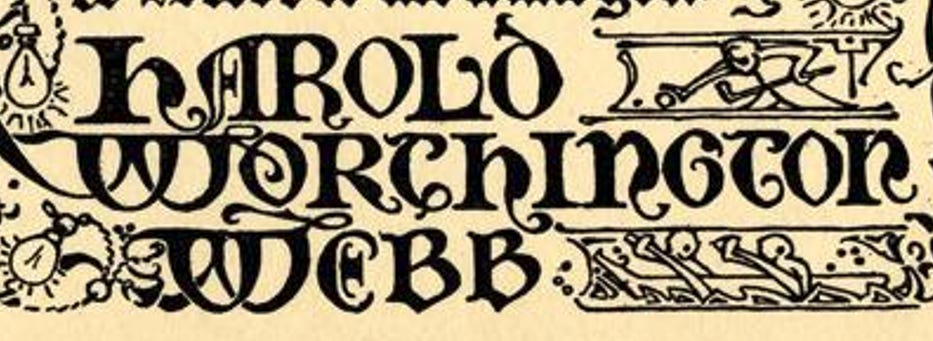
Lombardic capitals were originally used to mark the beginning of a new paragraph in manuscripts but unlike Gothic capitals they could also be used to form full words and phrases.

Other lettering
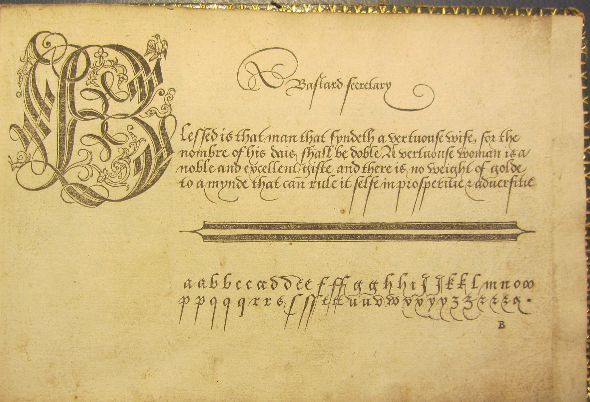
Webb had such varied lettering styles in her repertoire - Versal capitals, gothic script, Roman capitals… I might be wrong but in Allene’s, Katy’s and Melicient’s bookplates, the quotes at the bottom look like variations on Secretary Hand. I haven’t been able to find the exemplar Webb has used for these but I feel the exemplar I have below has the same vibe. Secretary hand was the dominant handwriting style in the 16-17th century, characterised by a more legible gothic script.


More examples of her lettering…
It’s obvious Margaret Ely Webb spent a considerable amount of time learning different lettering styles. Her ability to determine which would go with her particularly illustrations, tweaking things like letter thickness, ascender/descender flourishes, combining different styles goes unmatched in the bookplate world.
Download the book
Alphabets - A manual of lettering for the use of students with historical and practical descriptions, by Edward F. Strange, 1895.
You can also find used copies on secondhand book websites.
Read More
Learning to Read Secretary Hand by Kathryn James, 2020
L'arte di scrivere: tratta dal Dizionario d'arti e mestieri dell' Enciclopedia metodica (The art of writing: taken from the Dictionary of arts and crafts of the Methodical Encyclopedia), by Charles Paillason, 1796
Oh, lovely! And, yay, more books to look up! I'm trying to learn typeface design to create my own fonts so lettering is a super closely related topic.
this was interesting !! never really thought about lettering before but its so pretty