

Five drawing lessons from an original Margaret Ely Webb illustration
And my attempt to apply them!

‘ She was rarely satisfied with a design and usually parted with it reluctantly, thinking that if she worked over it a bit more, this spot and that would please her better.’ -Wilbur Macey Stone On Margaret Ely Webb, 1924
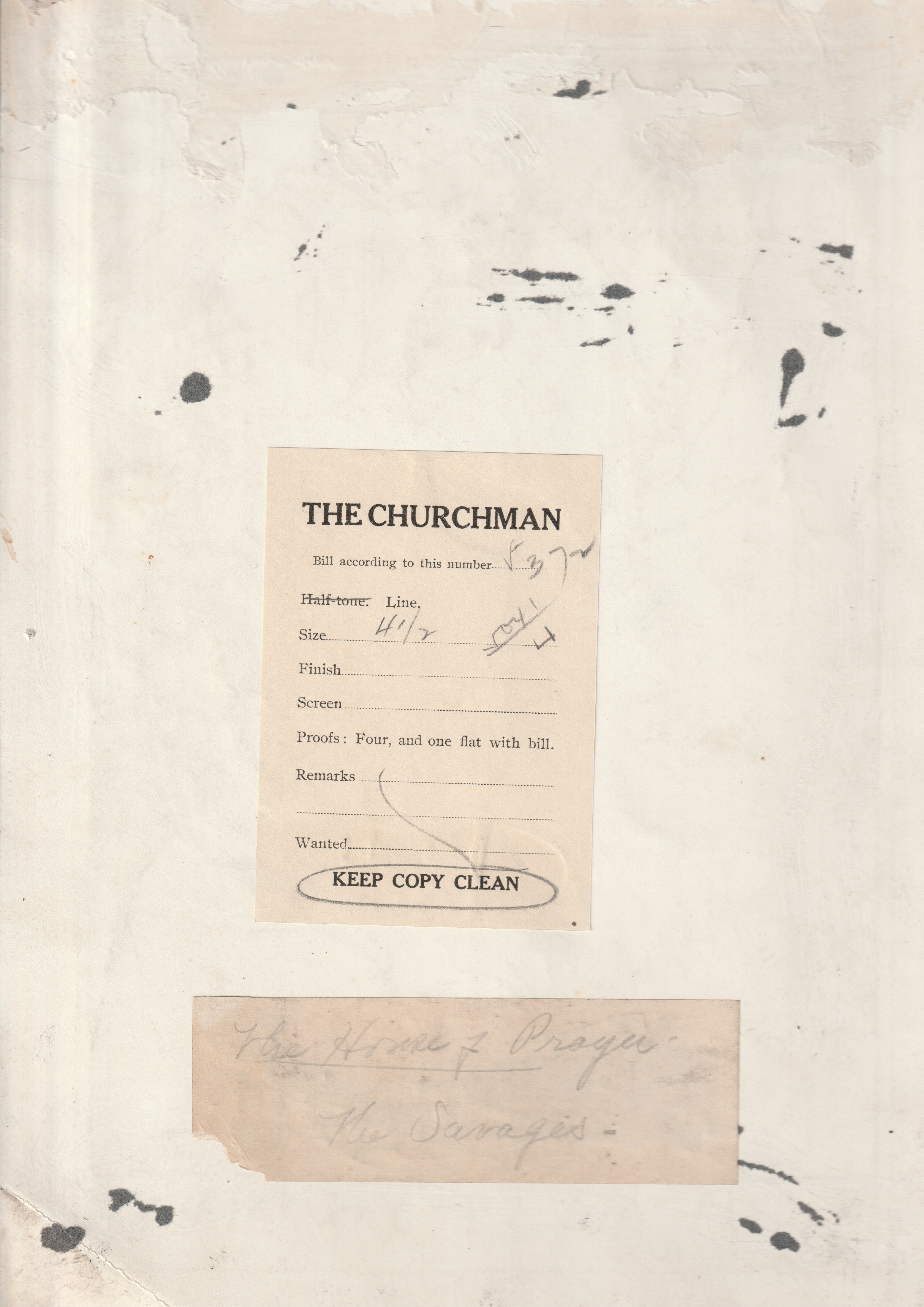
I’m pretty fortunate to own an original Margaret Ely Webb illustration. It was for Florence Converse’s The House of Prayer published in 1907 as a serial in The Churchman magazine and then as a standalone book in 1908 by J.M. Dent & Sons (publisher of Everyman’s Library series). While the book is relatively unknown now, it was widely successful, having been reprinted more than 15 times!
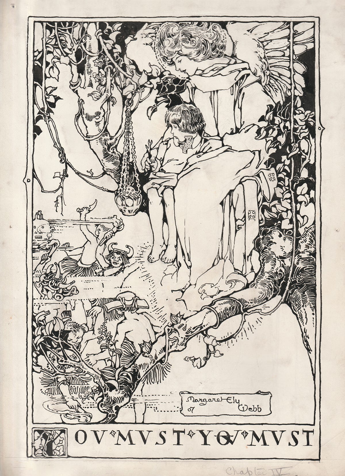
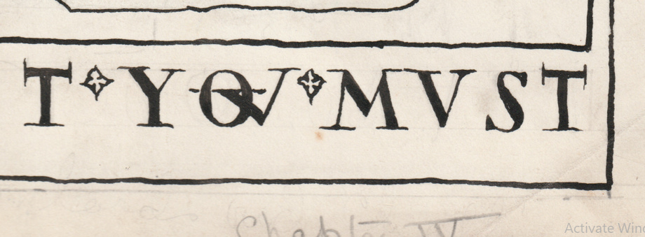
The illustration is for the chapter ‘The Savages’ (which is chapter 5 in the book, even if the bottom pencil mark says Chapter IV) and captioned ‘You must, you must’. There’s an angel (one of Webb’s favourite things to draw) with a child called Timothy up in a tree tangled with vines overlooking other children dancing. It’s around A4 in size and the backside has the original The Churchman final copy leaflet attached.
As an illustrator absolutely enamoured by Webb’s work this was a really rare opportunity for me to closely study her linework. Here are some lessons I’ve learnt by studying this piece:
1. Freehand straight lines
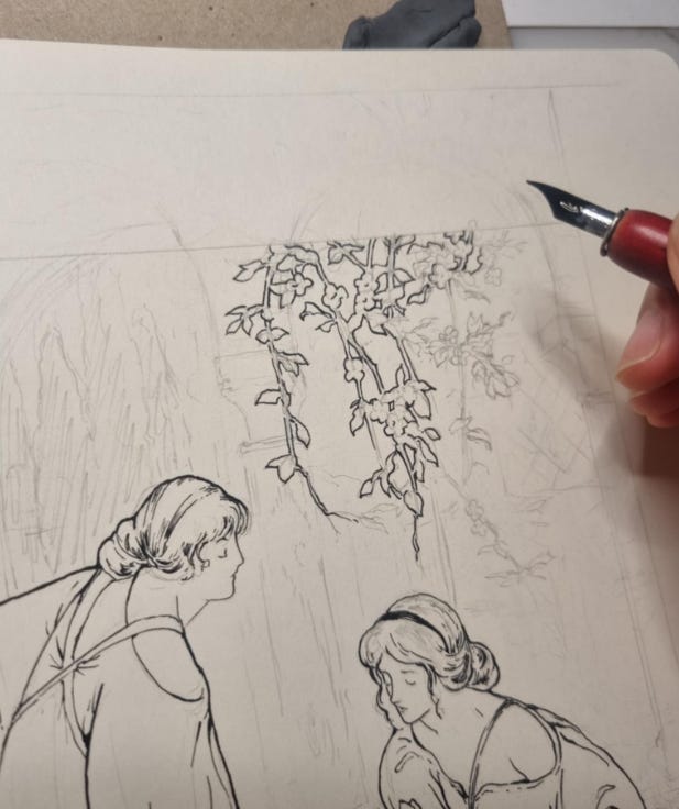
Webb’s borders, while simple, always integrate so well with the central work and it was only when I was looking at this work closely that I realised she hand-drew these straight lines without a ruler. At the corners you can see straight pencil marks which indicate she did initially rule straight lines as a guide but then went over them in ink freehand. She embraced any of the varied pen pressure as it mirrors the natural ink quality of her central piece better than if she had ruled, uniform lines.
2. Don’t be an ink purist
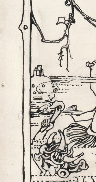
There’s evidence of scratching out on the surface of the illustration in key areas like the wings, the tree vines and areas of ‘white’ outline. I like this a lot as it shows evidence of her process and changing ideas on where white of the paper should show up.
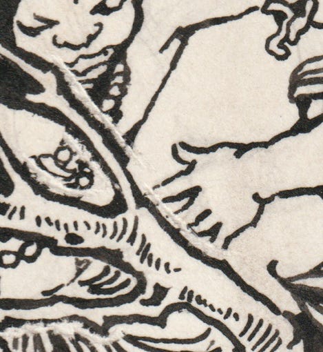
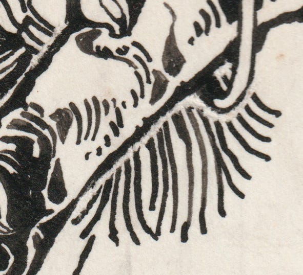


For the above close-ups it’s clear she wanted the tree to be distinct from the elements behind it so she scratched out a white border.
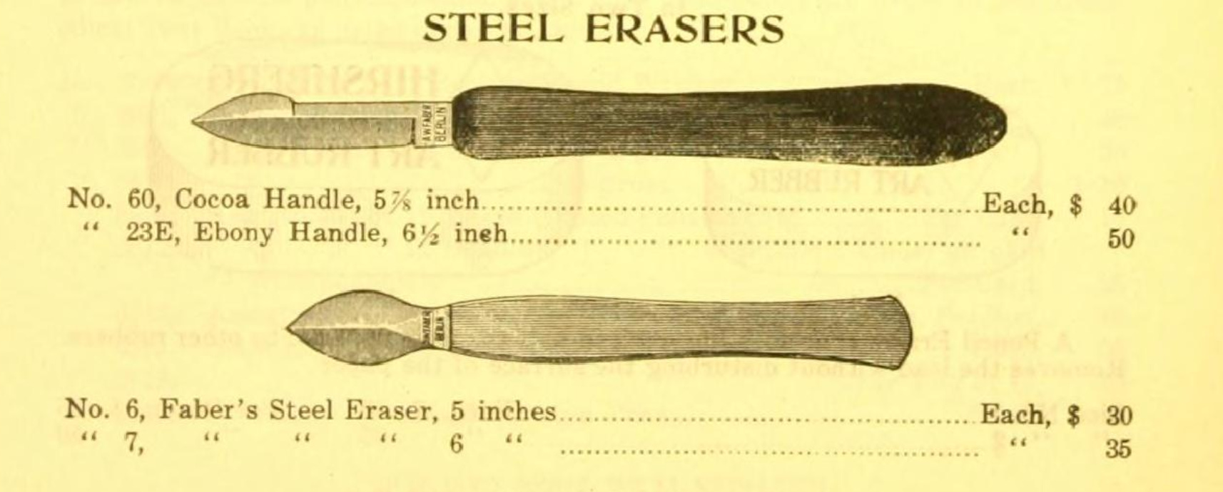
Wilbur Macey Stone wrote in 1924 of Webb’s work:
‘she often arrived at my office breathless with haste and demanding forthwith a bottle of India ink, pen and knife for final touches.’
Webb probably used an ink or steel eraser as a ‘knife’. Pointed with a sharp tip and curved edge you could scrape ink off gently from the top layer of the paper.


I thought it was important to note this and ‘not be an ink purist’ because often when we see finished inked drawings on the web or reproduced in books, they look flawless and rendered without faults.
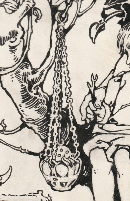
3. Merge shapes and lines
There’s a lot of detail in this Margaret Ely Webb piece. But you’ll find there’s some areas where she’s merged details into one shape. This technique you’ll find in Arts & Crafts era illustrations, for example like the chain of the censer (the metal incense burner).
4. Add Webbing
I’m not sure how else to describe this but she has a tendency to smooth over or round off sharp joins. Anywhere there’s T or Y junction made by a few lines she fills up the gap with a little more ink.


5. Study from nature
It’s clear Webb has spent a lot of time drawing from nature to be able to render the tree, leaves and vines in a way that looks effortless. Each leaf doesn’t look laboured on. In an interview in 1914 she said of her nature studies:
“But I do like drawing flowers, twigs, and out-of-door things from the things themselves, the pattern and the lines of them are so marvelously beautiful and beyond anything one’s pencil could achieve. I can’t draw them from memory at all.”
My attempt
Of course I had to try these lessons myself in my latest drawing ‘Silver Favourites’!
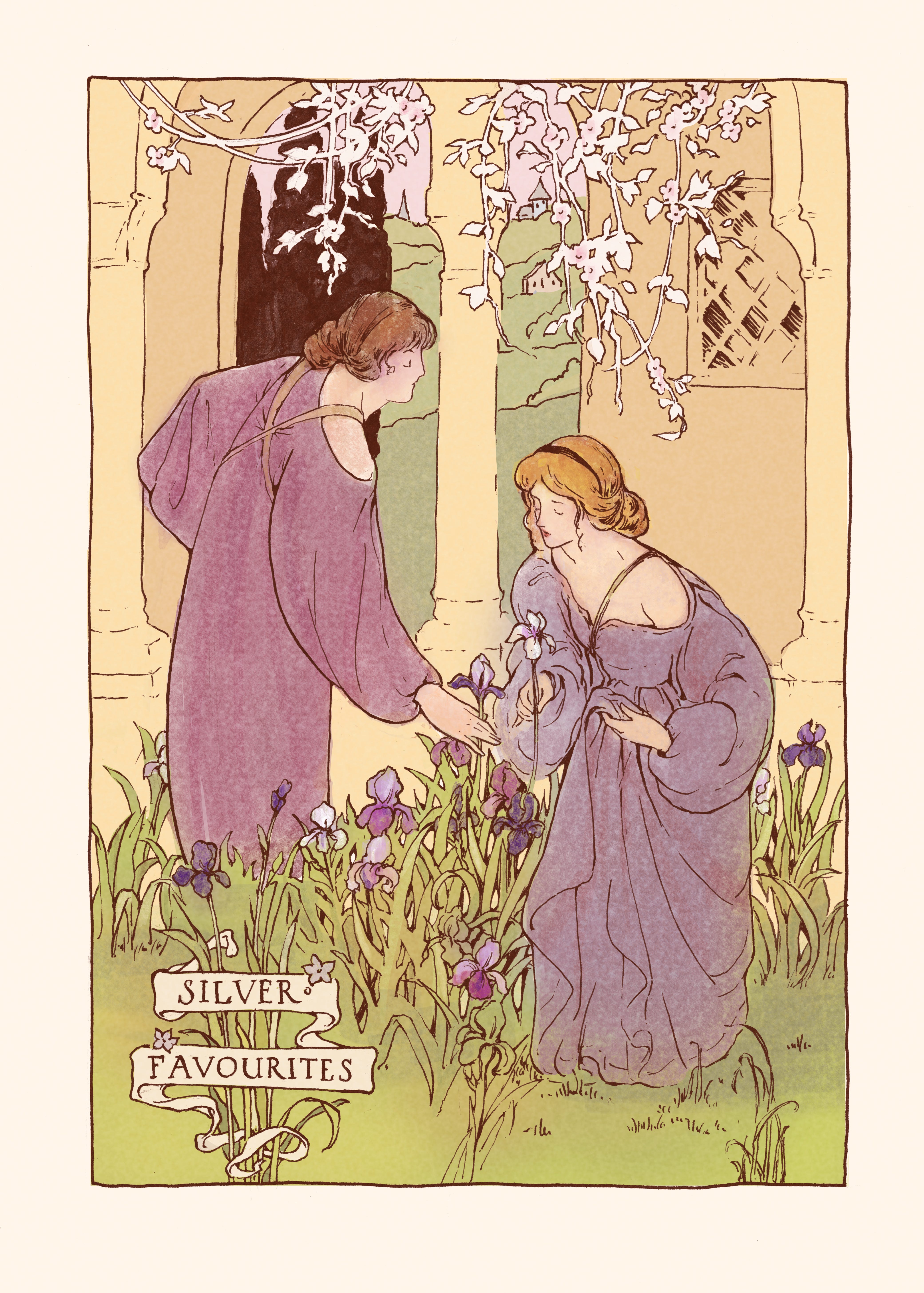
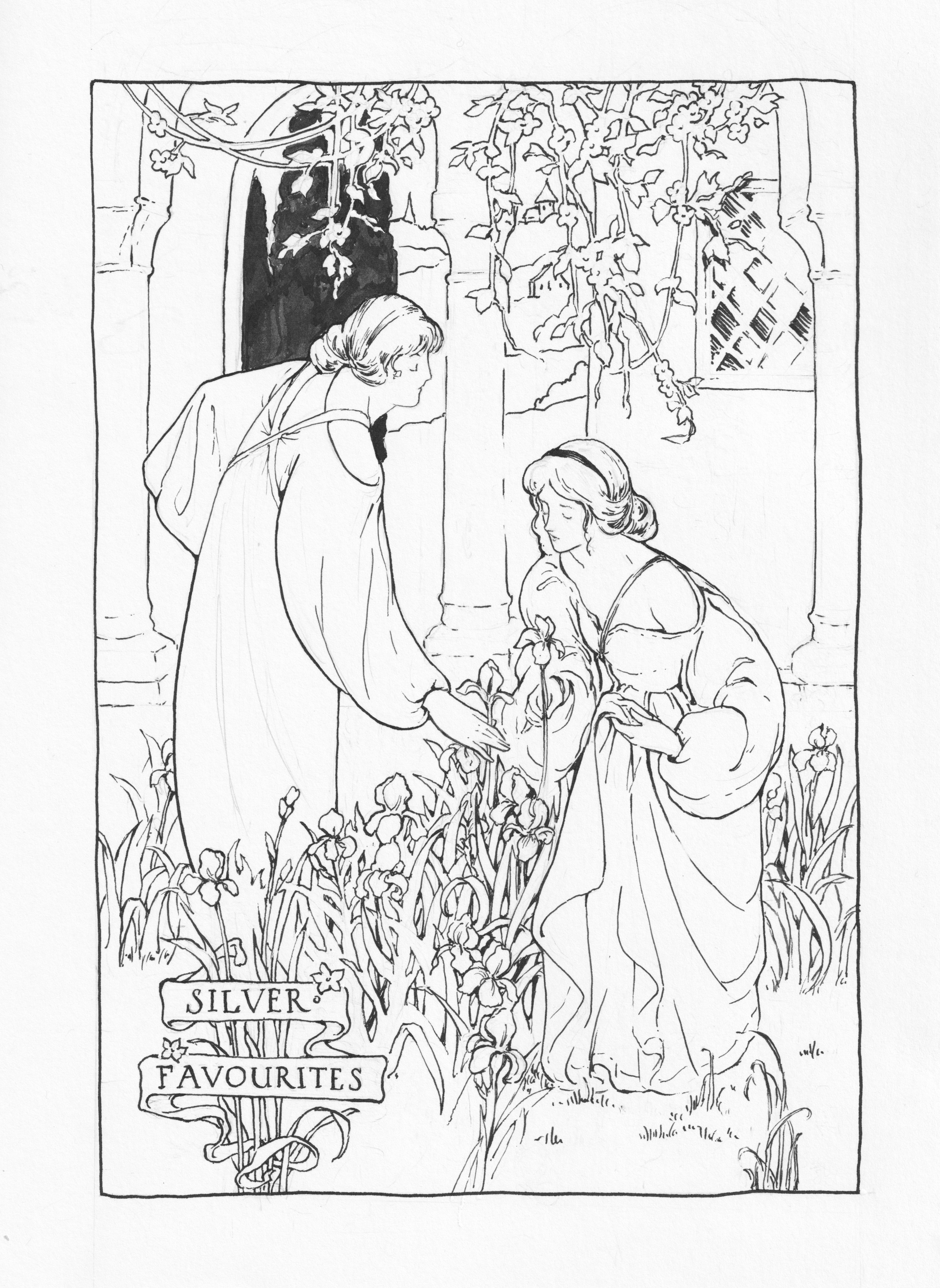
I freehand the straight line border, which was actually easier than you would expect. If you look to where you want your pen to go instead of where your pen is, it’s much much easier. The flowers hanging from the top I tried merging together. There are small areas where I introduced some webbing and the bearded irises I looked towards Flickr for my references. Googling bearded irises gave me too many pics focussing just on the flower when I wanted to see them from the ground up. Flickr has ordinary photographers taking pics of their garden which was perfect.
I used a Nikko G and Brause Pfannen #50 dip pen nibs with Kuretake Black ink on Moleskine sketchbook paper.
Hope you enjoyed this article! Would you be applying any of these to your own drawings? Let me know!
-Jess
Further Reading
The House of Prayer by Florence Converse - Internet Archive book (simply make a free account to ‘borrow’ the book)
See more of my Margaret Ely Webb research here.
Liked this article? You can now also buy me a coffee!
This is gorgeous.
This was so interesting. I have quite a large Nell Brinkley original newspaper collection. I sell pieces on occasion and have a FB for her memory as an important illustration artist. She was an extraordinary artist in my mind. I love your work and this time frame in illustration.